of a mental health support app
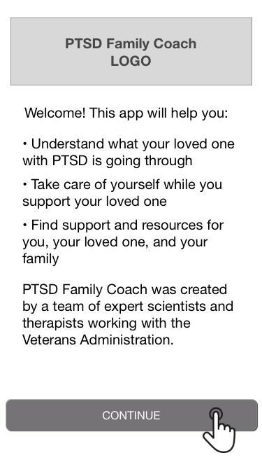
The Veterans Administration's National Center for PTSD developed an app for people whose partners have post-traumatic stress disorder (PTSD). It was packed with expert advice and self-care tools, but user attrition was very high.
The client had very limited development resources. Based on user tests and heuristic analysis we provided some technologically simple, prioritized recommendations:
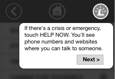
We created a global "panic" button in place of a long safety tutorial
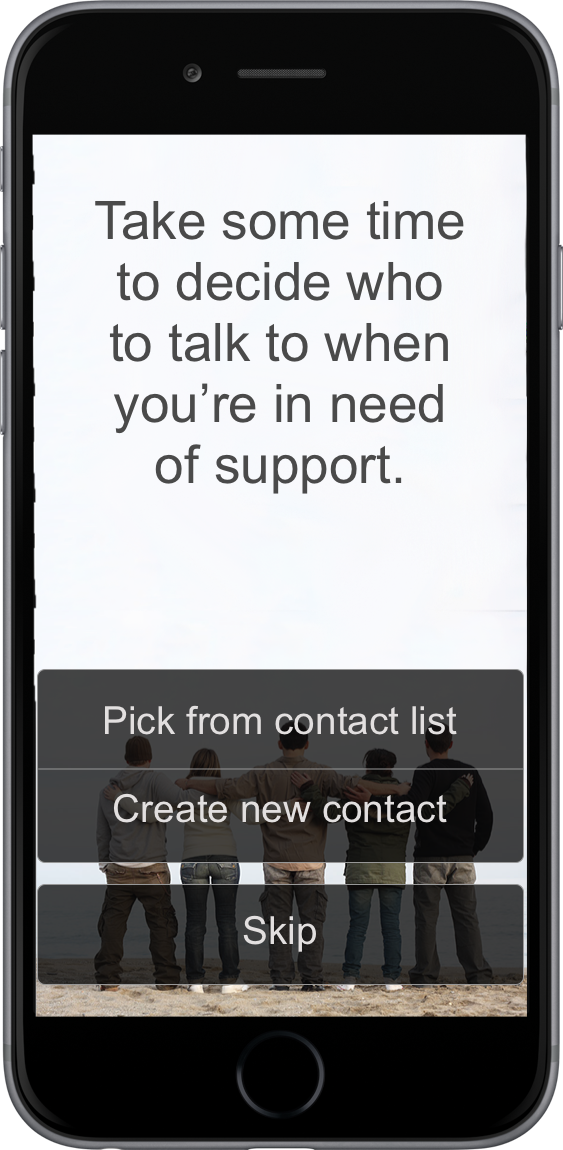
Problem: The setup experience was leaving users frustrated and suspicious. The app asked users to provide contact information for their closest friends, without clearly stating how it would be used. After that was a 30 minute tutorial on making a plan in case your partner becomes violent, which testers found "ominous."
Solution: Redesign the first-time experience around the user's goals.
We talked with expert clinicians and determined 3 key reasons a user might open the app:
- Learn
- feel better
- get help
First-time users might be busy, extremely distressed, or in crisis. They need help right away. So, we simply ask them which one they want.
Brief text to inspire trust

Direct lay-language question

Brief tutorial on specific section (plus global nav)
We gradually reveal the remaining functionality on subsequent visits or when they open new features. Users will be more likely to return if we let them do what they came for, as opposed to setting up features that might never be relevant.


Problem: Most users opened the app once and never returned. There were no reminders or suggestions to revisit.
Solution: Create pleasing notifications and progresive disclosure of features to make repeat use rewarding.
Clinicians told us that stress reduction tools are most useful if users practice daily, not just when they're upset. We outlined a program of daily notifications, leading the user to new app features or helping them explore the stress reduction tools.
We provided examples of notifications that users could experiance as relaxing rather than intrusive.


"At this point I would stop using the app... it thinks my problems are easily solved... it's not aimed at people like me."
This user was discouraged after being told to go for a run, even though she can't run due to health problems. The app then said to listen to a recorded meditation, but she couldn't stop and put on headphones.
Problem: To reduce choice overload, the app suggests one stress reduction activity at a time. It starts with random activities, and learns user preferences over time. But users were unlikely to keep trying if their first experiences were bad.
Solution: Create an introductory "quiz" that sets expectations and collects data to improve recommendations immediately.
We also recommended other potential data sources:
- For the first few visits suggest popular, broadly effective activities
- For very specific recommendations, (e.g., sing along with the radio, make a scrapbook) display several options so users feel less excluded by ones they can't do
- When the user is highly stressed, give them one of their past favorites instead of trying something new
The app had a lot of stress and behavioral data that it wasn't using in recommendations. We outlined a simple recommendation algorithm that the client could implement without machine learning expertise.
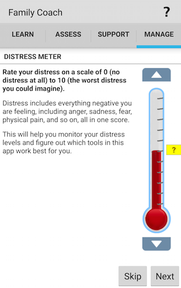
Problem: Users are asked to rate their stress level before and after stress reduction activities. The instructions were dense and chatty. Users were confused and frustrated that they couldn't get to the tools they'd come for.
Solution: Simplify the writing, improve the visual flow, and make it easier to opt out of the ratings.
The buttons to rate an activity were only available while in the middle of the activity. We moved them to the post-activity page, below.


Problem: Our client was unhappy with the look of the app. Our in-person test users frequently commented on the dated look and the odd cartoony characters (informally dubbed "meeples").
Solution: Prototype a new interface based on more recent Veterans Administration apps, but test before doing a major redesign.
We suspected that the negative opinions might be specific to tech-forward Bay Area residents. We quickly mocked up two potential re-skins and did randomly-assigned five second tests. We used Mechanical Turk and a the TurkPrime recruitment service to target women 35 and older living in the US South and Midwest. Ratings of trustworthiness, modernness, and perceived helpfulness were ~75% for all 3 designs and differences between them were small.
We advised the client not to prioritize a visual redesign so they could focus on more effective recommendations.

Users were frequently getting lost because the global top-level navigation looked like section-specific navigation. We replaced it with a more obvious, persistent navbar with recognizable "home" and "back" buttons (see image below).
The educational materials had a three-level hierarchy, with each level on its own screen. Users had to bounce back and forth between the text pages and the table of contents. We recommended a collapsing/expanding interface to let users better see their progress and context.

We demonstrated how image backgrounds and headers could be added to text-heavy sections without other interface changes. Initial responses suggested that the delight-to-effort ratio was huge.

The Veterans Administration's app was full of great content, but users weren't finding it. Based on some brief user testing, we were able to recommend ways to put the user's needs at the center, guiding them to the help that they came looking for.
Currently the stakeholders are seeking funding from within the organization to implement our recommendations.